9 Ways to Display House Numbers
There is more than one place to put a house number, and the choice changes how quickly your address gets found. Here are nine ways people display house numbers, what each one does well, and how each one behaves after dark, which is when most of them are actually tested.
1. Horizontal, beside the front door
The default, and the fastest to read. We scan numbers left to right, so a horizontal run needs the least effort from a driver.
After dark: depends entirely on the porch light, which is usually above and to one side, so it rakes shadows across the characters. Backlighting solves this properly.
Best on: almost any house with a clear stretch of wall beside the entry.
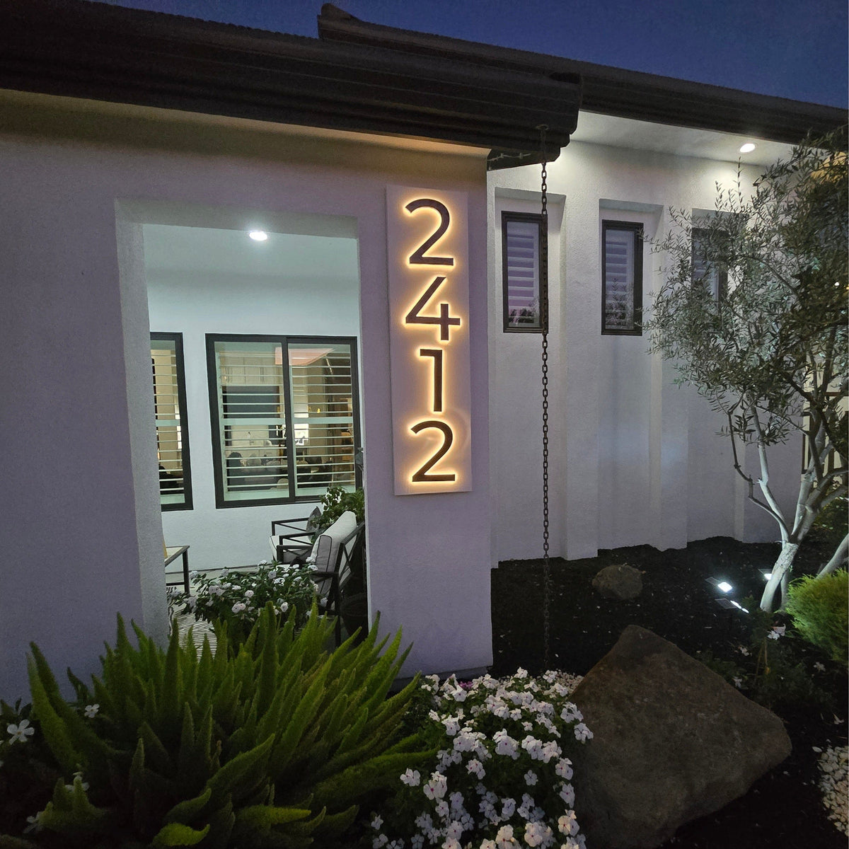
2. Vertical, on a column or narrow panel
The look that has taken over modern exteriors. A vertical run turns the address into an architectural element rather than a label.
After dark: excellent when backlit, because a narrow column gives a clean, even surface for the halo to fall on.
Watch for: vertical reads slightly slower than horizontal, so size up a little, and keep the spacing generous. Crowded vertical digits blur into a single stripe at distance.

3. Above the garage door
The largest uninterrupted surface on most houses, and usually the part facing the street most squarely.
After dark: often the worst-lit spot on the house, because there is rarely a fixture aimed at it.
Watch for: height. Numbers above a garage are usually 10 feet up and 40 feet back, so you need to size up considerably. This is where 10 to 14 inch characters earn their keep.
4. On a contrasting backing plate
Numbers mounted onto a panel, which is then mounted to the wall.
Why it works: this is the fix for a difficult surface. Dark numbers on dark brick disappear. Put a white plaque behind them and they read instantly. It also gives you a flat mounting surface on stone, rough brick or lap siding.
After dark: very good, because the plate gives the halo a clean, even background instead of an irregular one.
5. On the mailbox or mailbox post
Right at the curb, which is where a driver is looking first.
Why it works: it puts the number at the decision point, before the turn rather than after it.
After dark: nothing lights a mailbox. This is one of the best uses for a solar-powered unit, because a mailbox post is usually out in the open with no shade.
6. A free-standing monument or marker
A pillar, post or stone near the entrance carrying the number.
Why it works: essential when the house is set well back, screened by planting, or behind a gate. Numbers on a house that nobody can see are not doing anything.
After dark: plan the lighting and the cable route before the footing goes in. An unlit monument is invisible for half of every day. There is more detail in our guide to free-standing address monuments.

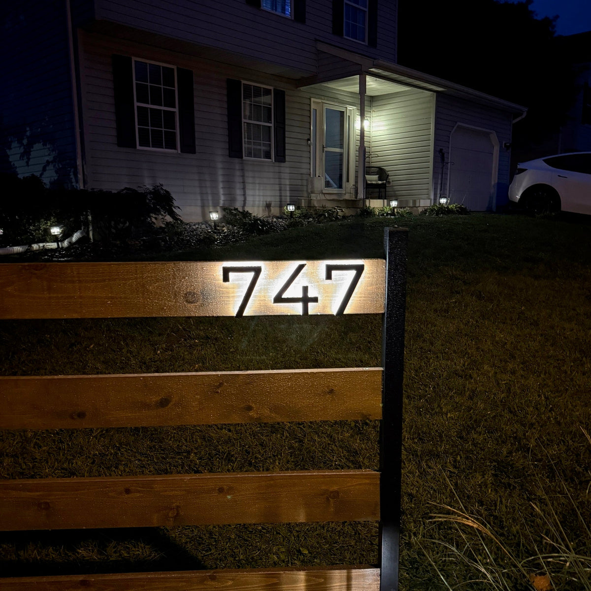
7. On a gate or gate pillar
For gated entrances, the number belongs outside the gate, not behind it.
Watch for: never mount on the moving leaf of a gate. When it is open, your address swings out of view or points at the hedge. Put it on the fixed pillar.
After dark: a gate pillar is usually a clean flat surface and often has power nearby for the gate motor, which makes this an easy place to do backlighting properly.
8. On a stone or boulder in the front yard
Handsome, permanent, and a good fit for rural and landscaped properties.
Watch for: contrast. Dark numbers on grey stone photograph beautifully from six feet and vanish from a moving car. If you want a dark finish on a dark stone, the lighting is what will make it readable, so plan it first.
9. Two sets, in two places
Underused, and often the right answer. One set at the curb or on the mailbox for the approach, and a second set on the house for the final few yards.
Why it works: the two sets do different jobs. The curb number gets the driver to slow down and turn. The house number confirms they are at the right door.
Watch for: keep them consistent in font and finish, or the pair looks accidental rather than deliberate.
Three things that apply wherever you put them
- Size for the distance from the middle of the road, not from the sidewalk. Roughly one inch of character height per ten feet of viewing distance, and more on a fast or curved road.
- Test contrast in black and white. Photograph the numbers on your phone and convert the picture to greyscale. If the number and the wall become similar shades, you do not have enough contrast, whatever the colours look like in daylight.
- Mount at five to six feet where you can. That is eye level from a car window and below the glare of a porch light.
What to avoid
- Script or decorative fonts. They look good on a doorstep and are unreadable at 30 miles an hour.
- Spelling the number out in words. Emergency crews are scanning for digits.
- Mounting on a storm door, shutter or anything that opens.
- Diagonal or staggered layouts. They read slowly.
- Polished finishes that mostly reflect surrounding light, so their apparent brightness changes with the weather.
- Any position that is clear in February and hidden by foliage in July.
The short answer
Horizontal beside the door reads fastest. Vertical on a column looks best on modern houses. Above the garage needs bigger characters than people expect. A backing plate fixes a difficult wall. A mailbox, monument or gate marker is the answer when the house cannot be seen in time. And two sets, one at the curb and one at the door, beats one set almost every time.
Whichever layout you choose, our backlit LED house numbers come in six sizes from 5 to 14 inches, six finishes and four fonts, with a live preview so you can see your own address in your own layout before you order.